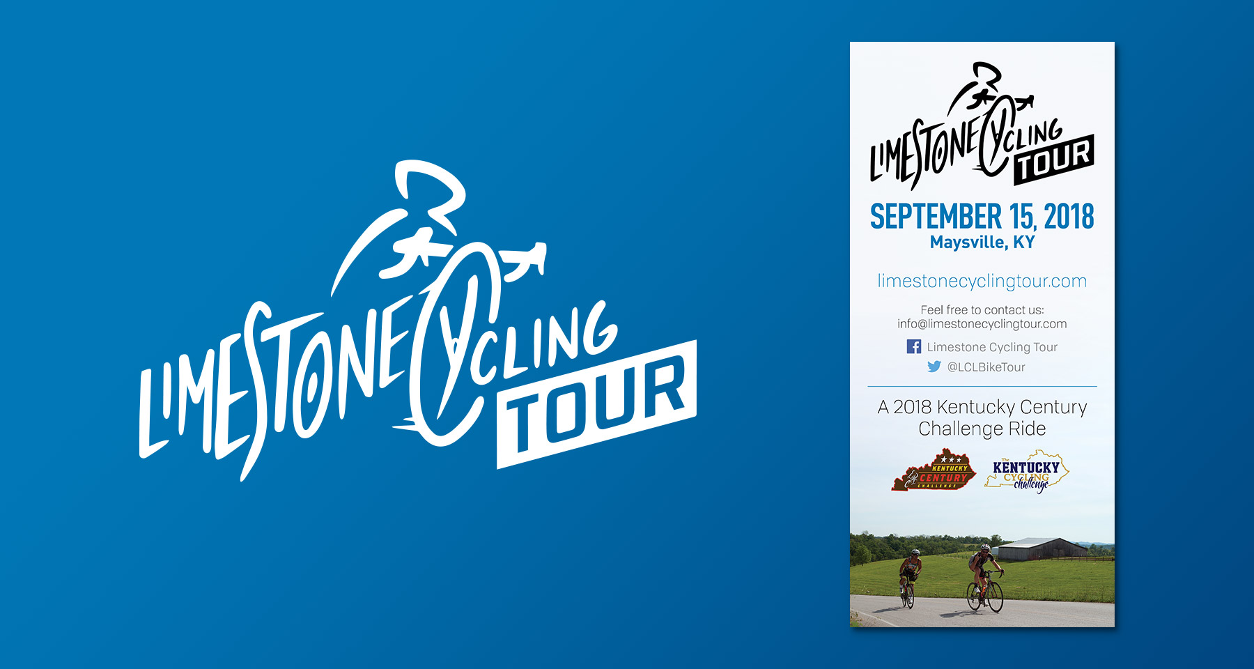
The Limestone Cycling Tour began as a memorial bike ride, growing over 10 years to become an annual community event. For 2018 they gained status as one of five Kentucky Century Challenge rides, and with this increase in attention the organizers wanted a proper identity to represent the event. Influenced by the energy of the Tour de France’s mark, I wanted to design something playful yet respectable. A logo with movement that invoked the inclines on the route, with flowing organic strokes, that was simple to understand and hopefully a little bit cool.
These images ran as Facebook ads around Valentine’s Day. Facebook ad standards only allow minimal copy on images, but holiday themes pair well with planning products to create a strong visual message.
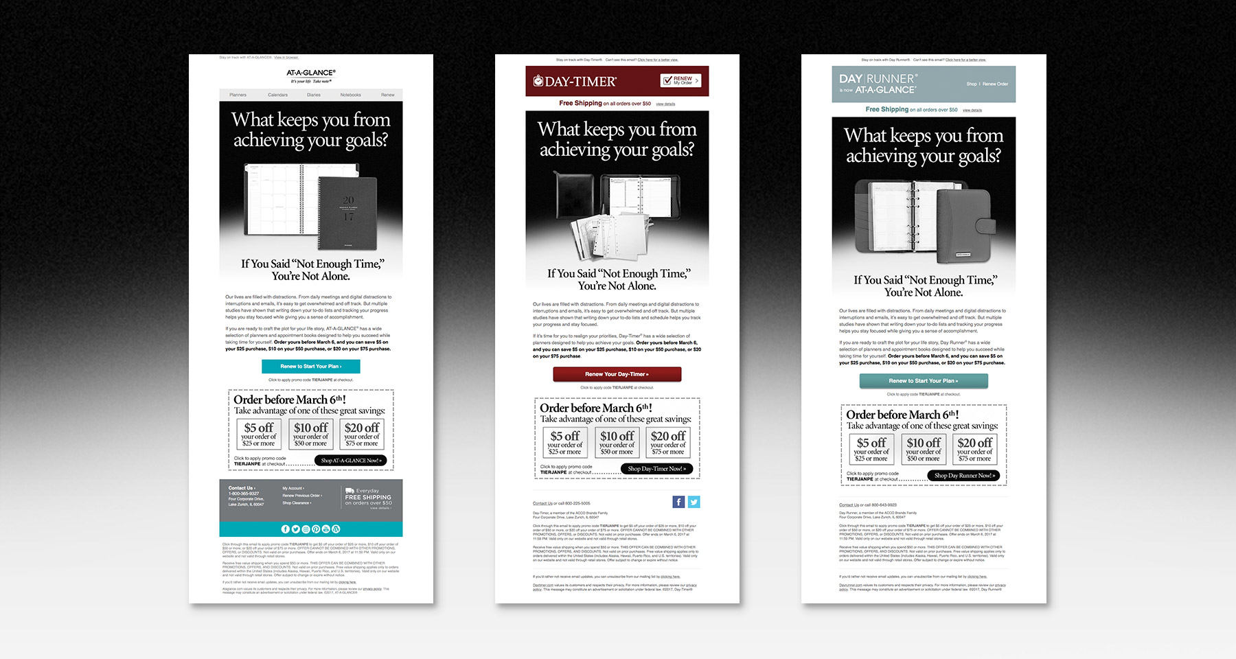
A marketing email, with design influenced by the look of black and white print ads from 80’s magazines.
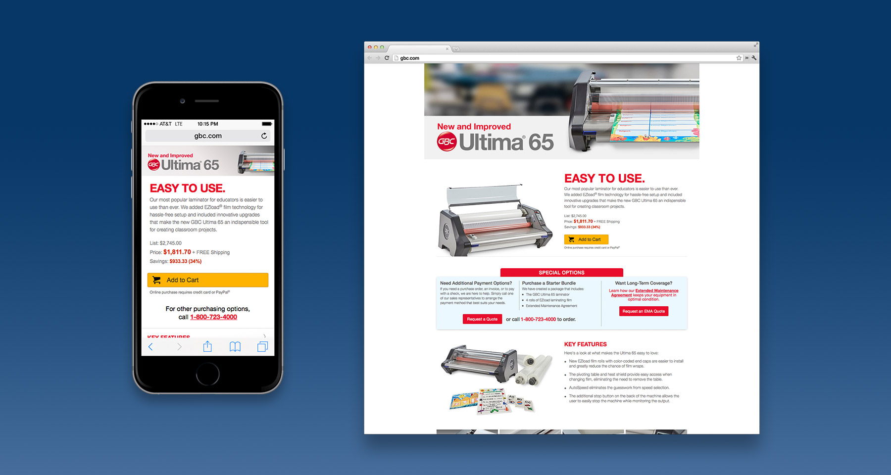
Custom-made and put to use on the GBC and Swingline sites for a few select products, these featured product pages were designed to show and tell much more about the hardware and address needs our templated product pages couldn’t meet.
We needed to pull in attention for a multi-brand sitewide Cyber Monday sale, and add flair to the idea of saving on office and school supplies. Imitating an option more readily available to a retail environment, I built up these neon sign styles and placed them on a clean but rugged interior wall. Not content with stopping there, I also set aside the time to animate a basic light-up sequence.
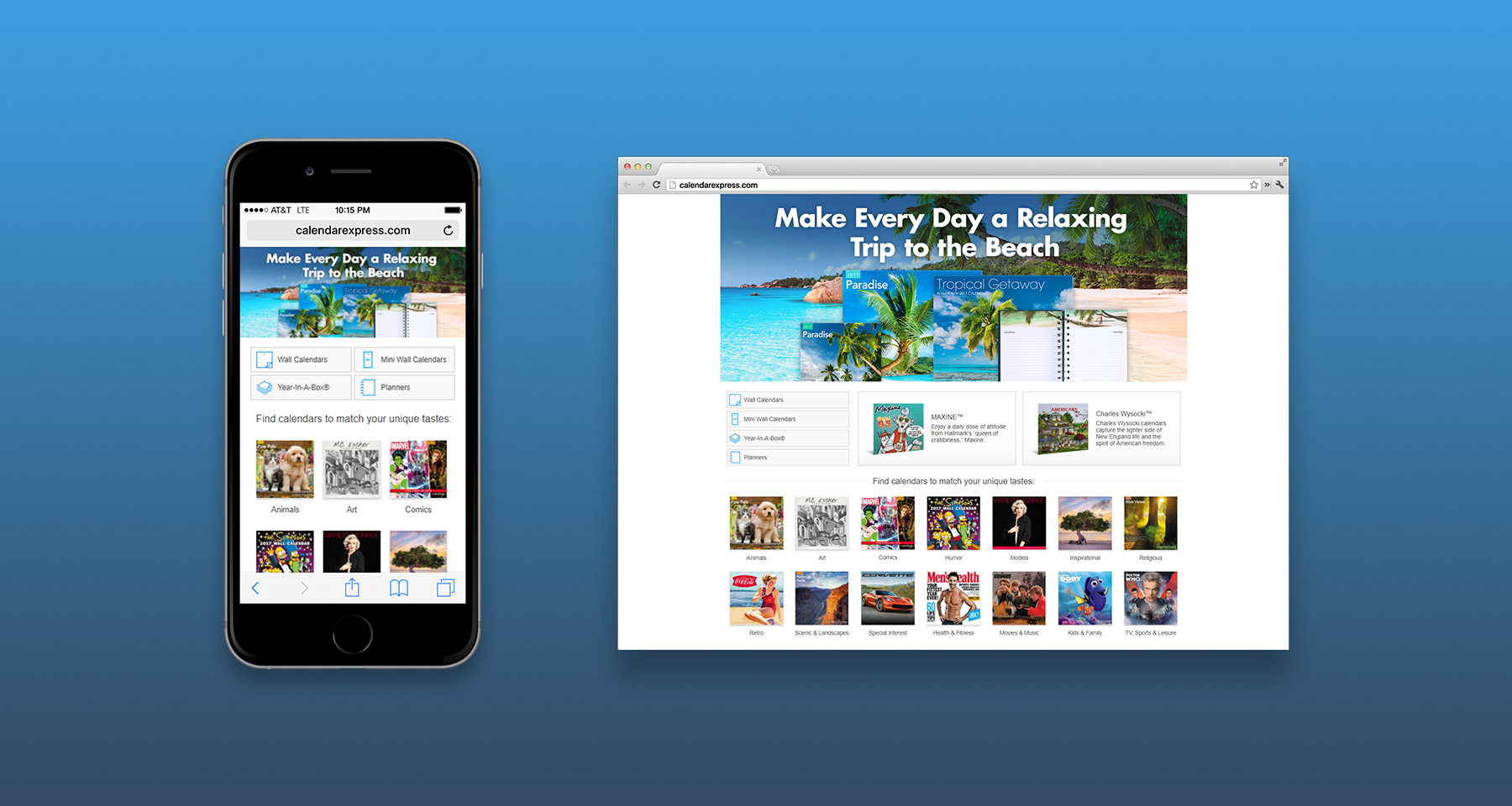
ACCO Brands’ calendar-specific site CalendarExpress had been saddled with a templated homepage that did nothing to address the needs of selling decorative and licensed calendars. So I designed a new responsive homepage that provided a better look at the product types and categories available. This included designing icons to illustrate the available calendar formats.
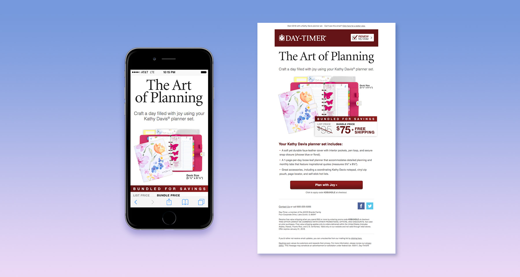
An example of a typical product marketing email featuring a licensed fashion planner set. This one also included a bundled sale price, and was designed to be equally effective when viewed on mobile.
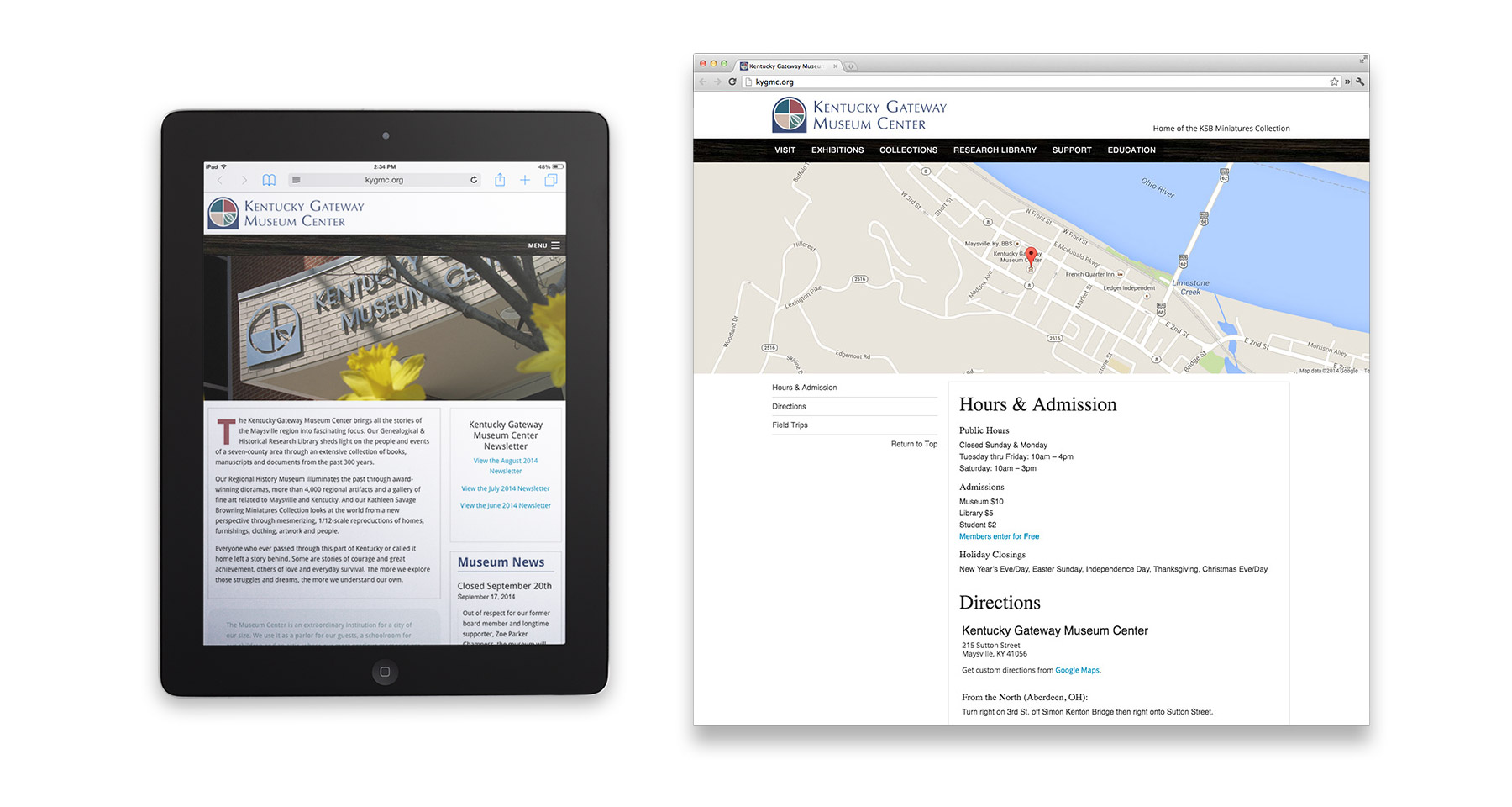
Local to my hometown, the Kentucky Gateway Museum Center wanted a new website to replace their beige-colored, difficult to change site from the early 2000’s. I designed a clean, contemporary responsive framework meant to better inform visitors and represent the museum’s offerings. The museum is modest in size, but features a library of local historical information, an extensive miniatures collection, historical exhibits, and a hall for temporary and traveling exhibits they need to keep people informed on. To put updating the site in their own hands, I built it around WordPress and provided instructions to assist them and avoid errors.
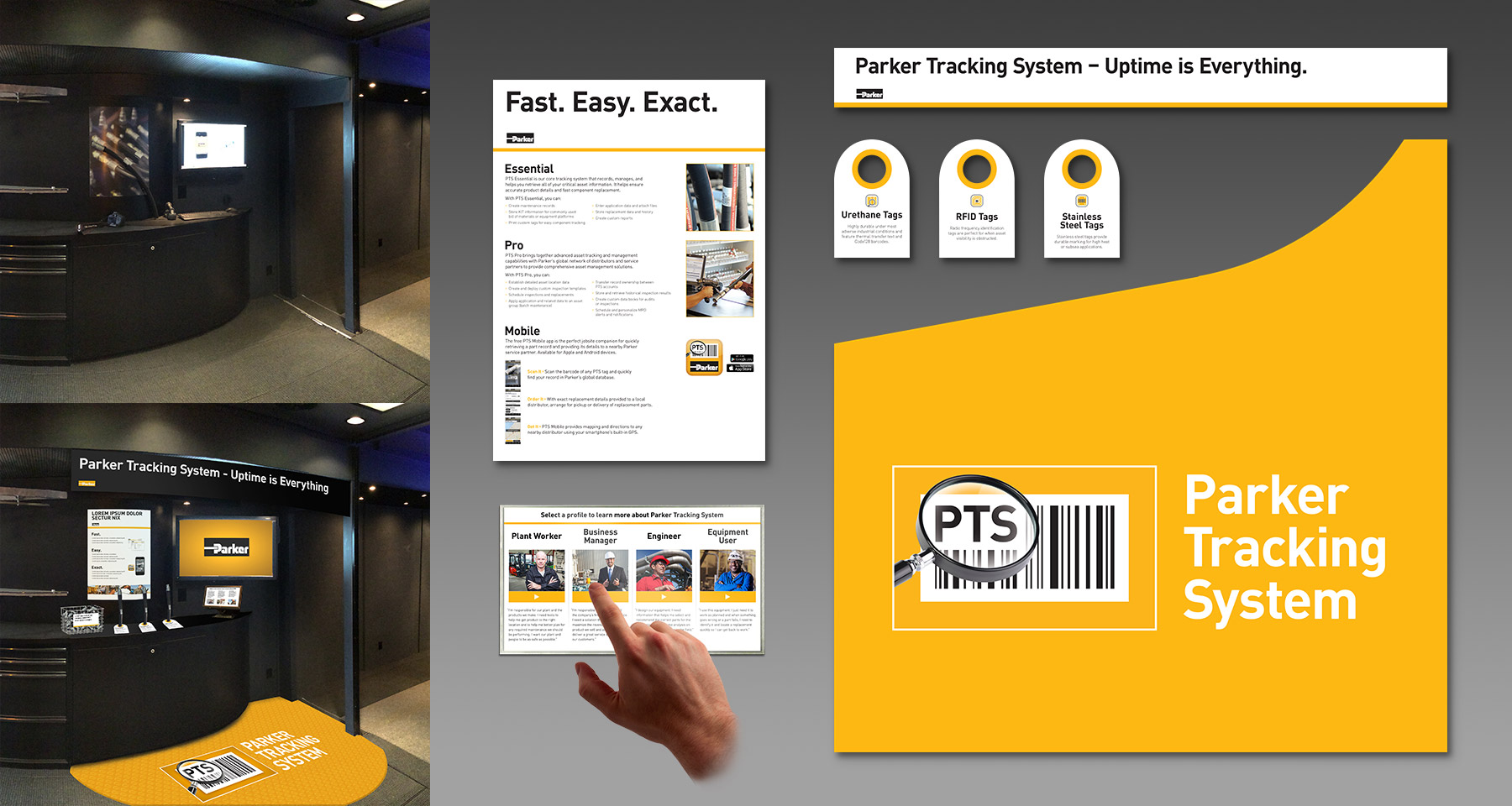
Parker-Hannifin wanted to increase awareness of their inventory and maintenance tracking system PTS, by adding a space within their tour truck showcasing this product. After a rough visual mockup got the client’s approval, the exhibit design was solidified into a few components. A banner and floor mat to define the space, a information poster and tagged display samples to explain the product, and a selectable video presentation on how the product benefits people at different industry levels.
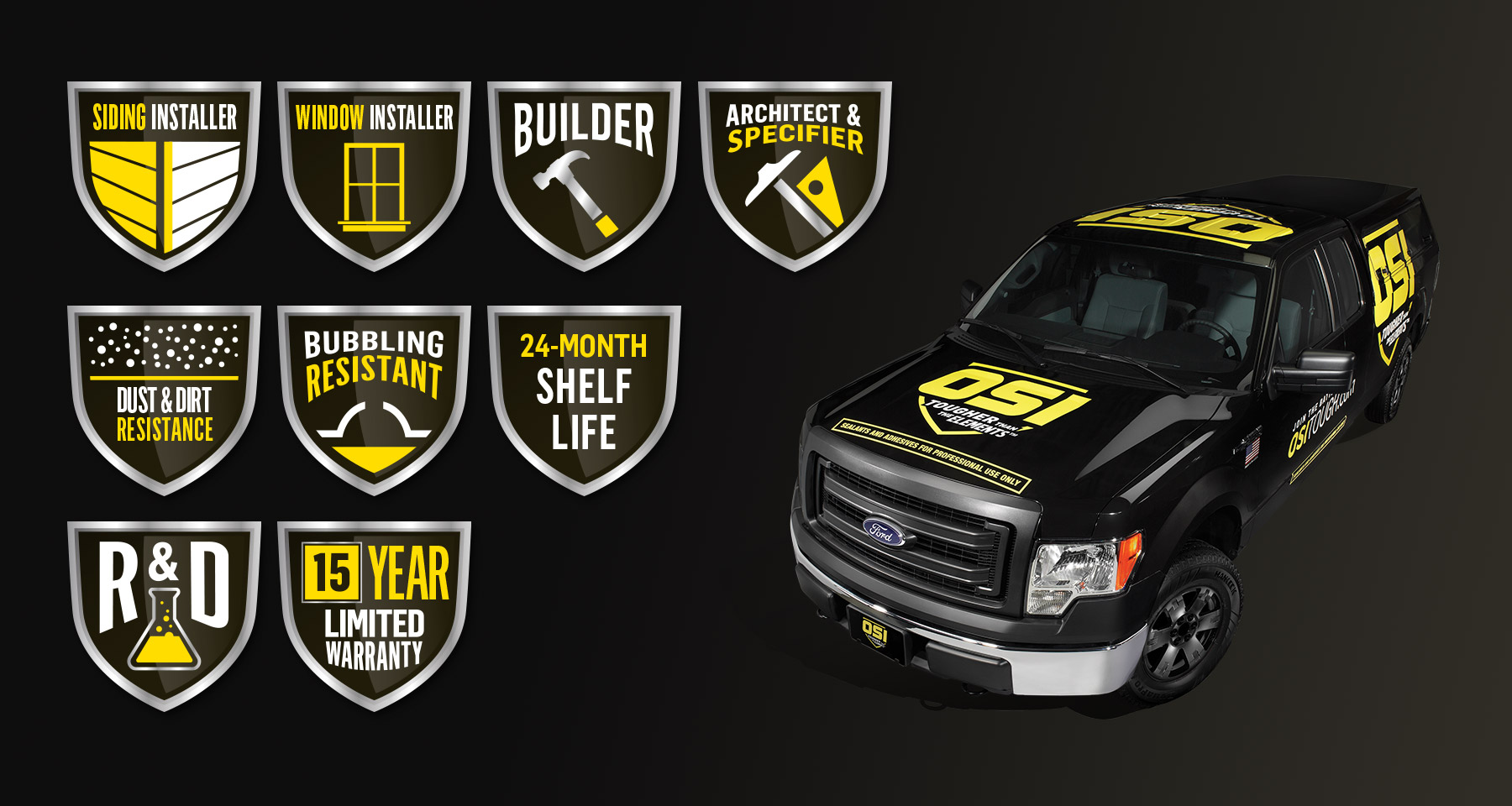
When Henkel re-branded their OSI line of products, I collaborated over the course of a year on ad concepts, product demonstration materials, printed collateral, as well as website designs that included an exhaustive design documentation. I created additional icons to represent product features and target demographics, and also oversaw designing a vehicle wrap for company sales vehicles.
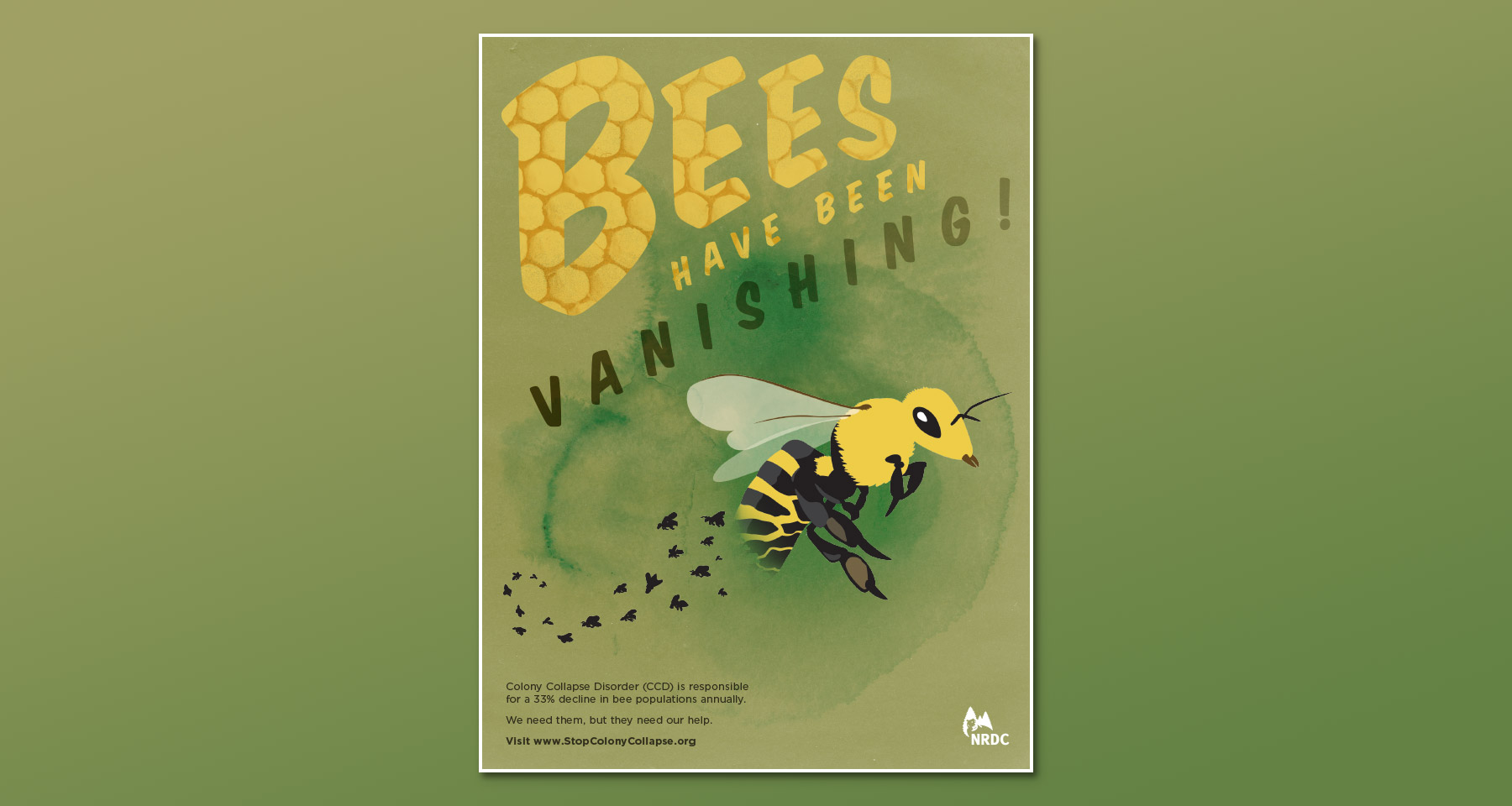
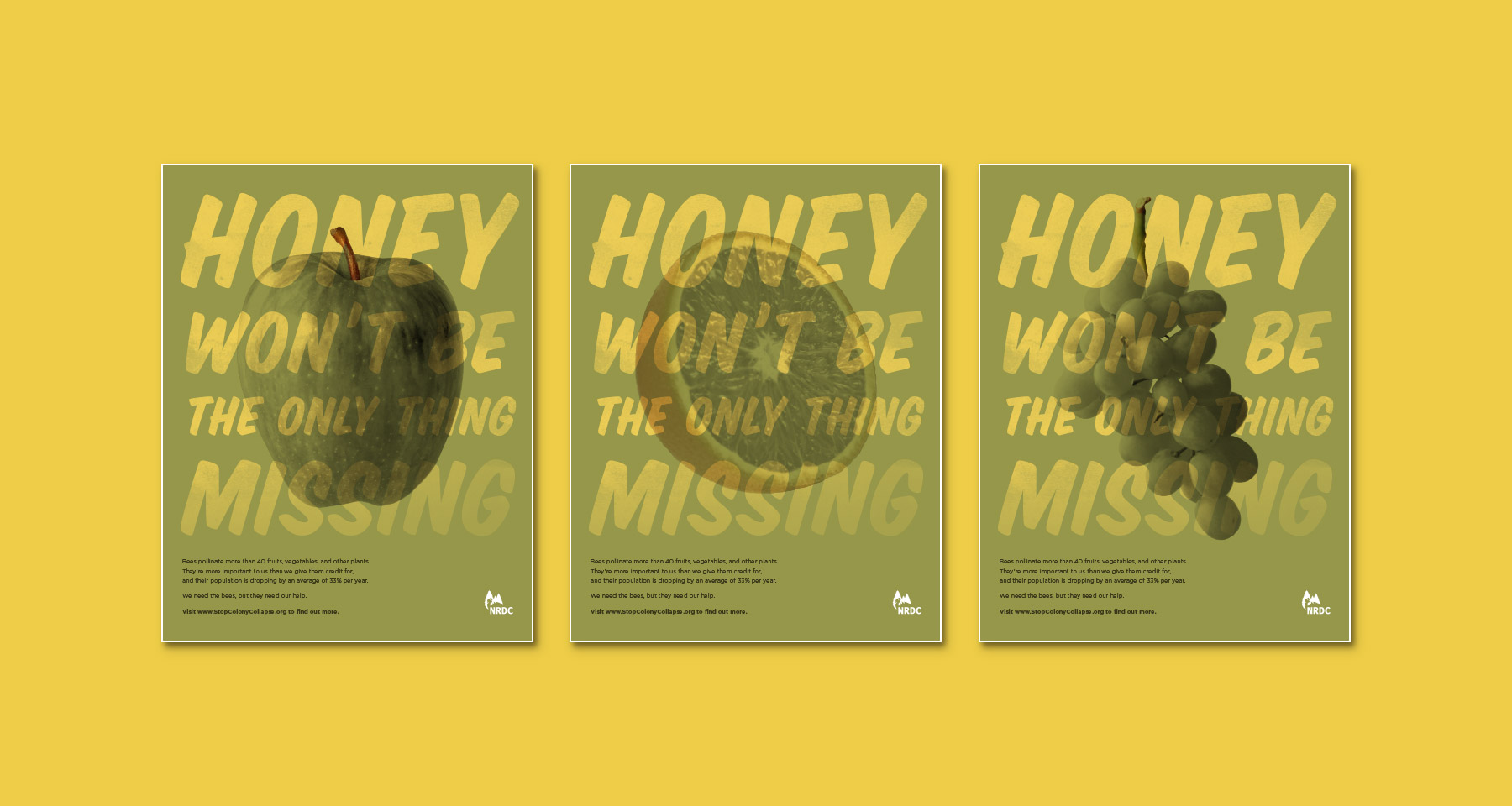
Another student project, selecting an ecological cause from the National Resources Defense Council and desiging an ad campaign to raise support for that cause. I chose Colony Collapse Disorder and took a two-pronged approach: directly statign that bee populations are in decline, and making the case for what human society stands to lose alongside bees.
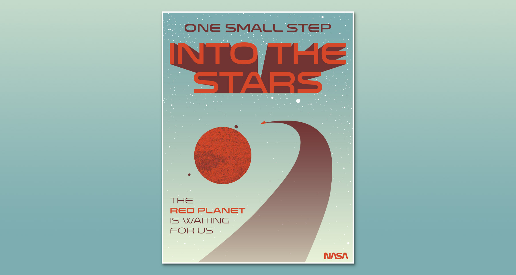
A simple student project where I chose to design an optimistic tourism poster in support of NASA venturing to other planets in the future. The final piece was produced as a short-run three color screen-print.
A series of identity and branding projects completed as a student.
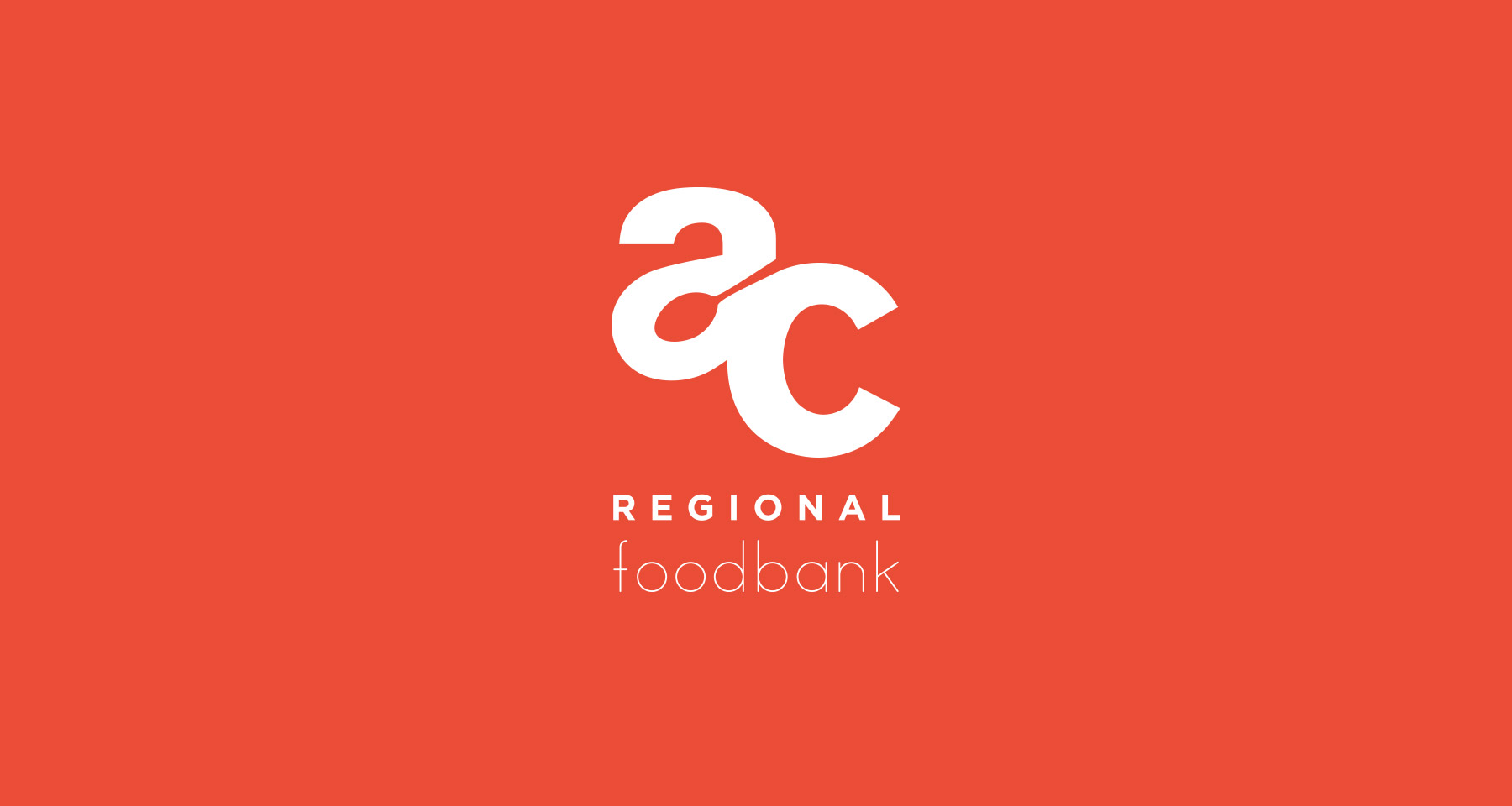
Akron-Canton Regional Foodbank: Due to the level of food-insecure families in the state, I wanted to use friendly forms and primary colors. And I found a nice spot for symbolism in the negative space.
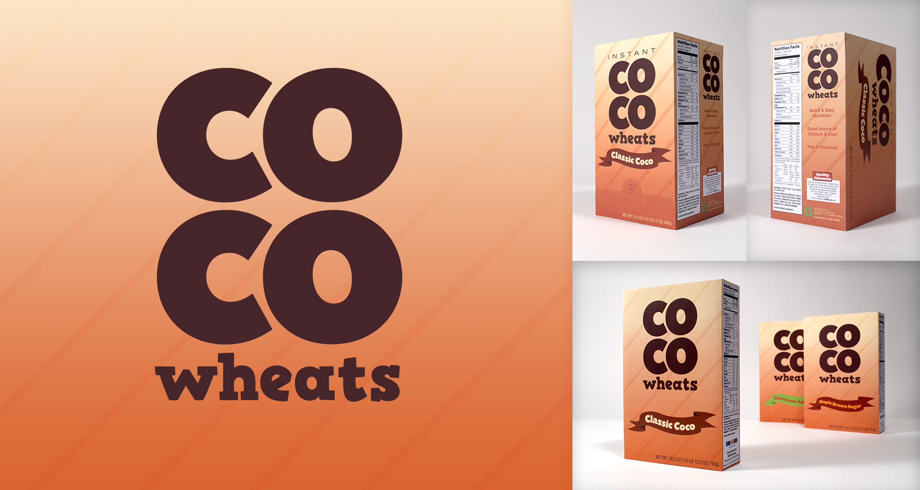
CoCo Wheats: A long-standing instant breakfast cereal, the most iconic packaging element is it’s background. So I kept that, and gave it big bold letterforms in a simple design to stand out amongst other cluttered product designs.
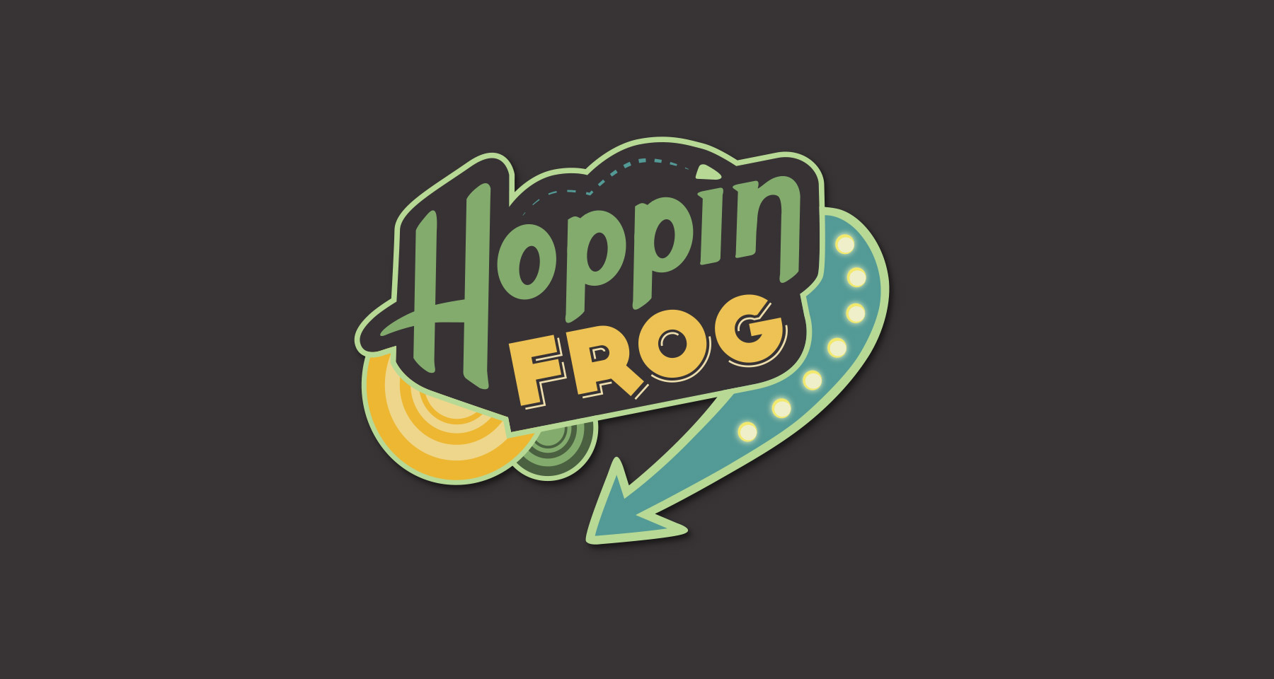
Hoppin’ Frog Brewery: Riffing on the name, I looked at retro 50’s diner signs for influence to add some personality to the brand.
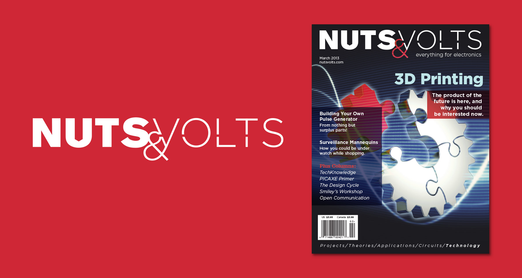
Nuts & Volts: An electronic hobbyist magazine with good content but a cheap appearance. So I made a masthead that includes nods to both the physical tinkering, and the mental understanding of open and closed circuits.
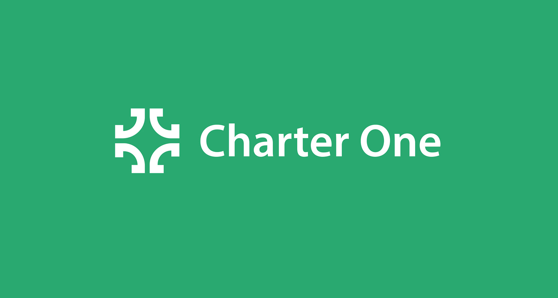
Charter One: A regional bank with a “3 C’s” value statement: Customers, Colleagues, Community. I wanted to allude to navigation with a compass rose form, as a play on the name and to symbolize the guidance a bank can provide. And made it out of four C’s to represent the company and it’s values.