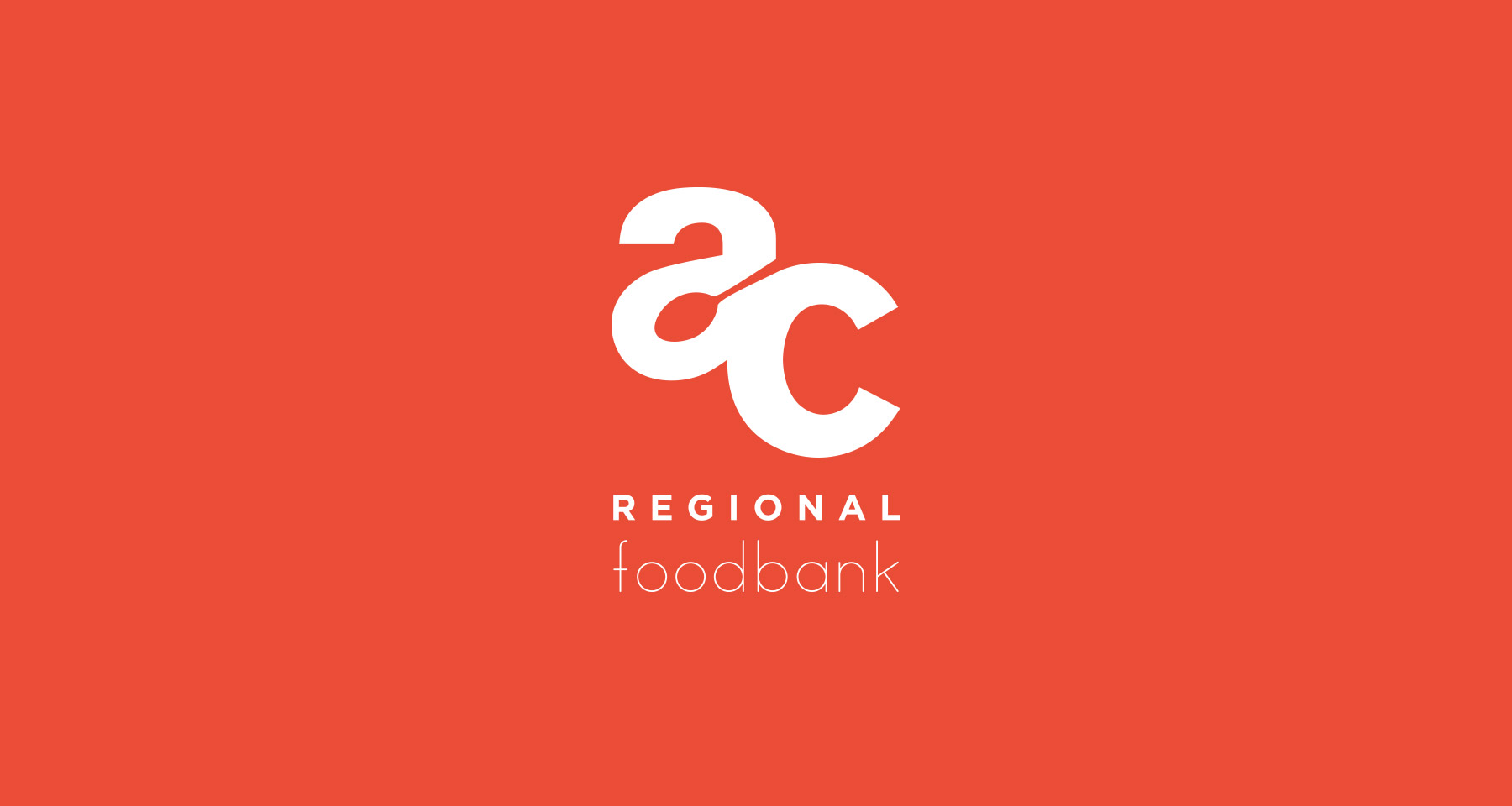
Akron-Canton Regional Foodbank: Due to the level of food-insecure families in the state, I wanted to use friendly forms and primary colors. And I found a nice spot for symbolism in the negative space.
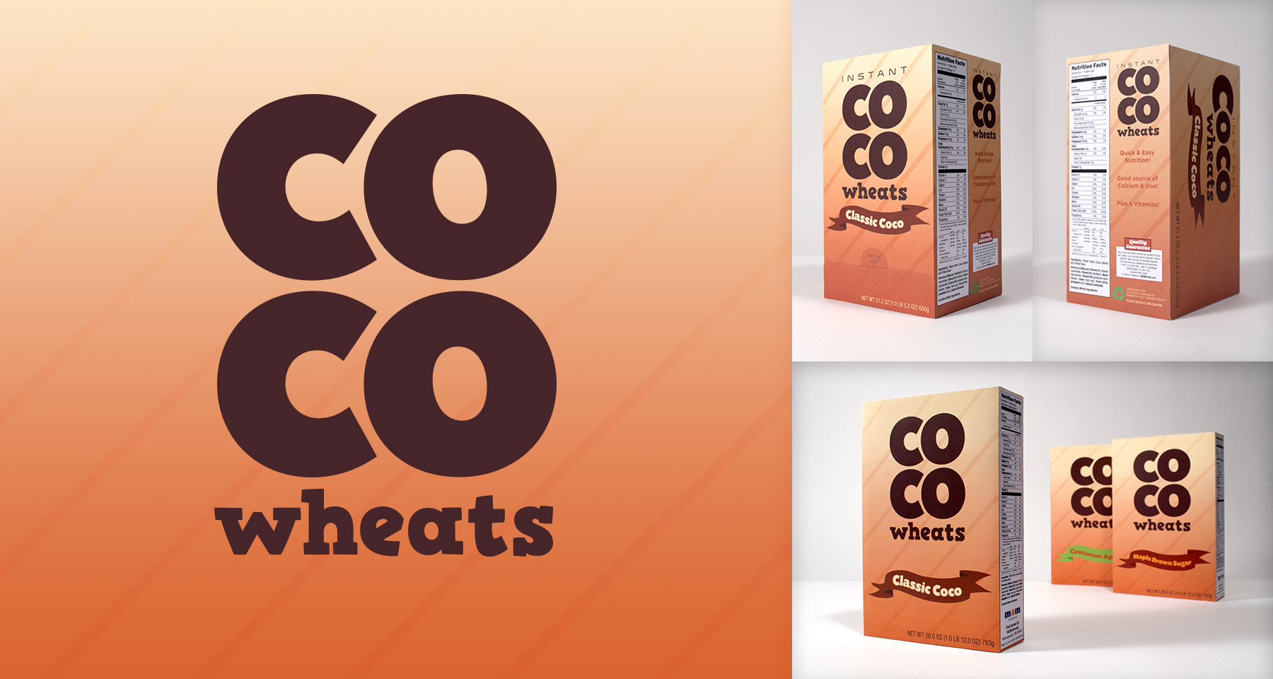
CoCo Wheats: A long-standing instant breakfast cereal, the most iconic packaging element is it’s background. So I kept that, and gave it big bold letterforms in a simple design to stand out amongst other cluttered product designs.
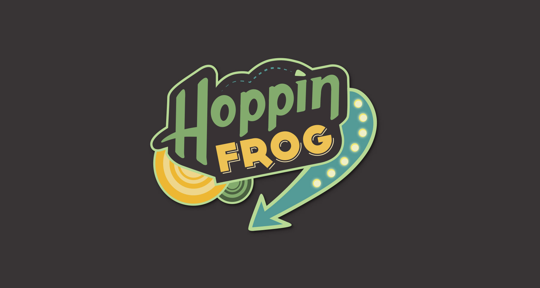
Hoppin’ Frog Brewery: Riffing on the name, I looked at retro 50’s diner signs for influence to add some personality to the brand.
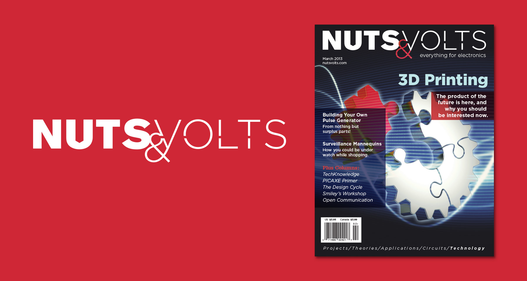
Nuts & Volts: An electronic hobbyist magazine with good content but a cheap appearance. So I made a masthead that includes nods to both the physical tinkering, and the mental understanding of open and closed circuits.
Charter One: A regional bank with a “3 C’s” value statement: Customers, Colleagues, Community. I wanted to allude to navigation with a compass rose form, as a play on the name and to symbolize the guidance a bank can provide. And made it out of four C’s to represent the company and it’s values.